Icon Development
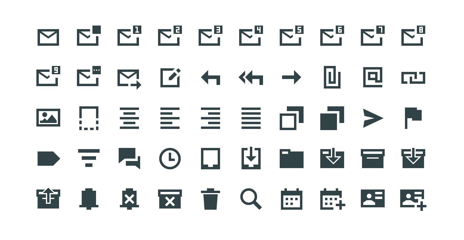
Icons are a language. At their best they communicate instantly, without words, across cultures and contexts. At their worst they are decoration — symbols that require a label to explain themselves. This project is about building the former.
Working within a complex hospital information system, the challenge was not to design a single icon but to develop a consistent system: a shared grammar of form, weight, and metaphor that could scale across hundreds of functions without losing coherence or legibility.
Every icon started as a concept question: what does this action feel like? What is its relationship to the physical world? From there, sketching — dozens of variations, testing recognisability, testing at small sizes, testing against the grid. The final forms are simple by design. Simplicity here is not aesthetic preference but functional necessity.
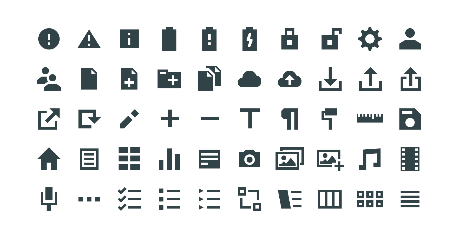
The result is a library that continues to grow — adding new icons as product features expand, always returning to the same principles: clarity, consistency, and the quiet confidence of a form that does not need to explain itself.
Since 2019, icon design has become a recurring thread across my professional practice. I have contributed to more than three icon libraries for large organisations — each with its own visual language, technical constraints, and user expectations to navigate.
At Meierhofer, I currently own the icon process end to end: defining the design principles, maintaining the active icon library, and ensuring consistency as the product evolves. Icons are rarely finished — they grow with the software, respond to new features, and occasionally need to be reconsidered entirely. Keeping a library coherent over time is a different discipline than building one from scratch, and one I have come to find equally demanding.